Since 2015, Google has put more and more pressure on website owners to make their sites mobile friendly. Over the past few years, the answer to the question: What does mobile friendly mean has changed when it comes to website design and development.
Generally, the meaning of mobile friendly is that your website performs well on a mobile device like a phone or tablet. However, you may also hear different terminology floating around like mobile friendly, mobile first, responsive design, adaptive design, separate mobile website (or m dot site) and mobile apps. Here’s a quick definition of each type of mobile site experience.

Free Online Presence Scan
Scan Now1. Mobile Friendly
What is a mobile friendly website? What is a mobile friendly website? A mobile friendly website is essentially when your regular website shrinks down to be small enough to display on a mobile device. It looks like a tiny version of your website. There’s a lot of zooming, pinching and scrolling going on, but the site displays and functions. It can be a less-than-ideal user experience, but at least your site is viewable. An example of this kind of website is sleepexperts.com.
2. Mobile First
Mobile first web design is when you start with the most basic functions and features for the smallest, least-powerful devices — like mobile phones.
This type of mobile web design allows designers to focus on what functions and features are most important to end users, who are accessing websites on the go more and more frequently. You can add new design elements as screen size (and processing power) grows, but the smallest, least-powerful device will still function well with mobile first.
Curious how it’s done? Mobile first coding begins with all the CSS styles, HTML, and Javascript necessary for the smallest screens. Then, it overwrites that code with exceptions for larger screens. Why does this matter? Well, the code for laptop and desktop computers might have large animations or more complex functions. If that complex code is written first, a smaller device like a smartphone would load all of that code before it realized it didn’t need any of it, leading to a slower user experience.
3. Responsive Design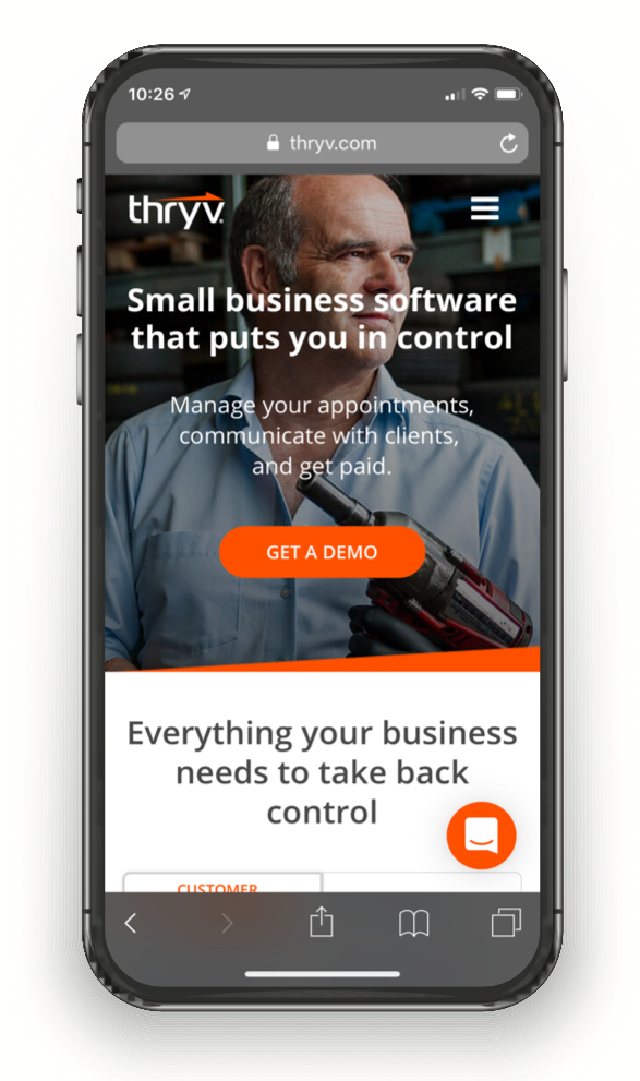
While mobile first design and development are strategies, responsive design is how you implement those strategies. Responsive design uses flexibly sized elements, controlled by style sheets, javascript and HTML, to fit the width of the screen viewing your site. No matter what size screen the user is viewing with, the text, images, navigation and graphics will size fluidly. It’s not device-specific or browser-specific. It’s designed to look good and function well at any size.
You can see how a responsive site will look on a mobile device by looking at it on your desktop/laptop and simply shrinking and expanding your browser window. You’ll see three columns shift to two, and then one. You’ll see pictures and graphics shrink and navigation adjust. A good example of a responsive website is this one, thryv.com.
4. Adaptive Design
Adaptive design is responsive design, but with a twist — it uses specific layouts for different devices. Where a responsive website would simply deliver the same content for both mobile and desktop, adaptive websites may offer up specific content when it detects a mobile device.
The main technical difference is that an adaptive site generally uses a predefined set of layout sizes based on device screen size rather than fluidly sizing down to fit. Here’s a great demonstration of the difference between adaptive and responsive design.
5. Separate Mobile Site (or m dot site)
When an existing website can’t effectively be converted to a responsive site, you’re not totally out of luck. Developers can build a separate website and host it on a subdomain. So if your regular, non-mobile site is http://mywebsite.com, then your mobile site could be http://m.mywebsite.com.
A separate mobile site has its own HTML and doesn’t have to look like the main site. Facebook’s mobile site is an m dot site.
6. Mobile App
Large retailers like Amazon have both a mobile site and a mobile app to meet the needs of all of their mobile customers.
A mobile app requires a user to download it from the app store and install it on their mobile device. Depending on the type of business and website, consumers may prefer an app over a mobile website experience, but that generally only applies to large brands consumers visit regularly and not to a retail or business site that they may only visit occasionally.
Free Online Presence Scan
Scan Now


